FANS OF The Baby-Sitters Club (BSC), a young adult series published by Scholastic Books between 1986 and 2000, will remember the club notebook, a private journal collaboratively written by the babysitters. In book number 56, Keep Out, Claudia!, the notebook is described as “more like a diary. In it, each of us writes up every single job we go on. Then we’re responsible for reading the notebook to find out how our friends solved [baby-]sitting problems, and to stay in touch with the lives of our clients.” Readers of the series typically encountered entries from the club notebook three times per installment. Most memorably, these passages appeared in the “handwriting” of each babysitter.
These handwriting styles have inspired discussion, imitation, and nostalgia, thanks in no small part to the tremendous success of the BSC franchise. What started as a modest series for girls became a media phenomenon consisting of more than 250 books, three spinoff series, a handful of graphic novels, a television show, and a movie. More than 180 million copies of the novels have been printed.
BSC presented models of girlhood for consumption — models referred to by Elena Schilder as “seven brands of human teenager,” each defined by “one or two choice adjectives.” As a young adult reader, I was not immune to the pleasures of imitation. Certain entries in my childhood diary were written to resemble Kristy’s style (“tomboyish, bossy”), while others, whose i’s were dotted with little hearts, were inspired by Stacey’s (“sophisticated”). As different as they might have seemed to the tween reader, all seven scripts were in fact created and produced by one graphic designer at Scholastic: Hollie Tommasino.
In this interview, Hollie, who has never publicly discussed her contributions to BSC, looks back at her work for the series from 1986 through 1996. She describes her process of producing the girls’ writing styles. She also recalls moments of inspiration from her own childhood and adolescence in Queens that shaped her approach to design during the 1980s — including those memorable little hearts above Stacey’s i’s.
¤
KELLY BLEWETT:Tell me about your role at Scholastic when you were hired in 1986.
HOLLIE TOMMASINO: I was one of three or four graphic designers in the Young Adult Department. The editor would send us a summary of the upcoming books, plus a few general ideas for the cover. It was our job to come up with different designs for each project. These designs would be presented at weekly meetings, where initial choices between design options would be made. Then we’d choose the illustrators and models, and go on photo shoots. In other words, we worked on the projects from conception to completion.
What was your role with The Baby-Sitters Club?
When all the design elements for the series were initially coming together, I created the handwriting styles for each character. And then I handwrote all portions of the manuscripts that were flagged by editorial — usually BSC journal entries, but also the postcards and letters and lists that popped up from time to time. I continued to produce the handwriting even after I left Scholastic.
What happened then?
I worked as a freelancer until 1996. At that point, due to advances in technology, I was sent font forms by a company. They asked me to letter each character’s handwriting in spaces on the form. And these forms were long! They had me do a few different y’s and then write a w attached to a y or a t attached to a y. They didn’t want the handwriting samples to look totally uniform, so it was quite an extensive process. After that, the freelance work stopped, but the books continued.
Could you walk me through how you originally attached these various forms of penmanship to the different characters — Kristy, Claudia, Stacey?
Well, the editors gave us a description of each of the characters in the series. They told us their general personalities, their likes and dislikes, their strengths and weaknesses. Once I had a picture in my mind of each babysitter, I created a handwriting style that I felt would reflect them. The process felt very intuitive and fun. It came pretty naturally, probably because I loved handwriting and had different styles of my own penmanship anyway.
So, for instance, Claudia wasn’t very good at spelling. Since this was a weakness, I made her handwriting smaller and more tentative, reflecting the lack of confidence she might have when writing. This was very different from Kristy’s or Stacey’s writing, which was bolder and more confident.
Do you remember when you first noticed different handwriting styles?
As a little girl, I was always writing letters and cards to friends. And I paid attention to the mail. My family got lots of letters, and I could tell just by the handwriting who it was from. I was very aware of the different personalities the writing styles expressed. I loved what you might call the art of handwriting. I would imitate my mother’s handwriting, which was very swishy-swashy and graceful, and my best friend’s handwriting, which was more bubbly and bold.
Can you locate us a bit more? What was your experience of handwriting in school?
I grew up in the 1970s in Queens, New York, where I went to a public school. I remember writing book reports, and notes to friends, and letters. And teachers would write on the board in their own handwriting. Some handwritings I admired and some I didn’t, but they all reflected personality — confident, bold, quick, sad, or shy.
Notebooks were a big thing. We had these loose-leaf binders — kids would carry them on the bus and throughout school. They were made of denim cloth, and people were always writing on them. Writing was all over the place.
I even remember looking at a milk carton while I was eating breakfast one morning, and there was somebody’s artwork, right there on the side of the carton. And I thought, gee, someday maybe I could design a nicer looking milk carton. Or cereal boxes. Graphic art back then was on the products and everyday objects right in front of you. These objects were different and unique and artistic. Everything was designed by hand all the time. It was a feast of handwriting in all different styles.
How did you get into graphic design?
I went away to college in Connecticut for one year and then transferred to Parsons School of Design in Manhattan, where I earned my BFA.
Did you start at Scholastic after college?
In fact, I started while I was still in college. I was looking for a summer job and saw an advertisement on the job board at Parsons for a designer at Scholastic Books. They wanted someone to come on full-time. I went for an interview, showed them my portfolio, and was offered the job. I loved working in a publishing company at a real job so much that I decided to continue to work full-time and go to college at night to finish my degree. It took me an extra year and a half to graduate, but it was well worth it. I was already working at a job I loved, a job that felt like a dream come true.
What did you like about Scholastic?
I liked how everything at Scholastic seemed different from my life as a student at Parsons. My classmates wore leather and chains. I remember a lot of spiked purple and green hair. I was just a shy family girl from Queens. Scholastic and the corporate world just felt like a better fit for me. And everything there revolved around childhood and art, two things I’ve loved since I can remember. The combination of the two was ideal. I love them both and still do to this day.
How did you create the handwriting samples?
I remember sitting at my drawing table, taping heavyweight bond paper down, and creating my own “note paper” using my T-square, triangle, and non-reproducing blue pencil. I would write the journal entries on lined paper to ensure it would fit exactly in the area allotted in the book. For some penmanship styles, I used rapidographs and for others I used markers. Each different type of pen would help make the handwriting look more distinct from the others.
What’s a rapidograph?
A rapidograph is a type of pen that you have to fill up with ink. There were a number of pens in a set, each with their own thickness. The width of the line of each rapidograph would always be uniform. I’d choose a pen from the rapidograph set based on how thick I wanted the line to appear. I feel like a dinosaur since that’s so different from how we work today! [Laughs.]
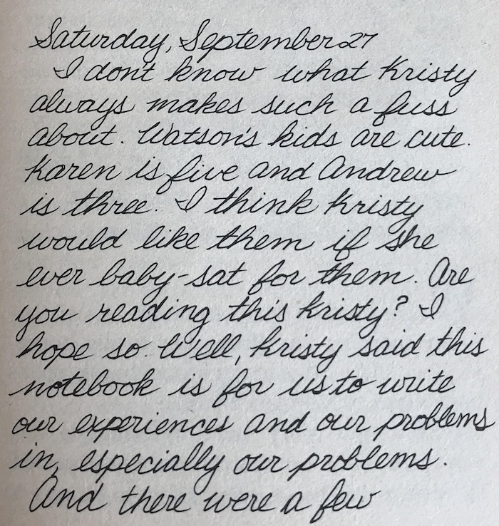
It’s interesting to hear about your process. It seems you might have used a marker to create Kristy’s penmanship since her handwriting is so bold, while a rapidograph would have been helpful for Mary Anne’s, since her penmanship style was so loopy.
That could be right. But really the choice of tools was not as important as controlling how my hand styled the letters. The fluidity of the movement was what mattered most. The markers or the rapidographs could have been interchangeable.
Mary Anne's handwriting
Kristy's handwriting
One character’s handwriting seems to have inspired quite a response in readers, more I’d say than the others. I’m wondering if you can guess which one got readers most excited.
Well, let’s see. I think it might have been the one with the little hearts.
Yes! Stacey. How did you develop that style?
That was certainly not unique. Kids would write like that all the time. I remember, going back to my own school days with those denim binders, how important it was to have an impressive signature. Your signature was almost like your personal logo, and so those loose-leaf covers would be filled with beautifully designed handwritten names. The really popular kids would write strongly and boldly, and the girls would add things like stars and hearts for decoration. When it came to Stacey and her personality, I’m sure I imagined someone like her from my own school days, and the handwriting just followed suit.
Stacey's handwriting
Which of the penmanship styles was closest to how you yourself wrote?
My handwriting is pretty variable. I’m actually flipping through a BSC book right now. They all look like mine. Also, I write differently based on how I feel.
Can you say more?
If I’m feeling energetic and positive, then my handwriting reflects that. If I’m sad or in a rush, if I’m concentrating on something or not really paying attention — all of this can affect my handwriting. I’d say that each of the handwriting styles in the BSC represents a way I wrote naturally at one point or another, although the differences between the handwriting styles are probably exaggerated. From a design perspective, I was always thinking about how to make each style unique and immediately identifiable. So, for instance, when Dawn was introduced into the series, I knew her writing needed to be unlike the other characters, and her clear oversized print with the backward slant made that possible.
Were you able to produce the samples quickly?
Yes, although different books required different amounts of handwriting. For the ones that were lengthier, I’d have to take breaks because my hand would get tired. I looked forward to doing the handwriting, though, especially as a freelancer. I looked forward to sitting down and getting the area set up and reading about the BSC story and getting into that zone of doing the handwriting. It was a lovely time and the work flowed easily.
Did you have a handwriting style that was your favorite?
I don’t think so. I just liked the creativity of the handwriting and designing. It didn’t matter which one it was, it was just the fact that I was using my hand and putting a flair into the penmanship that was enjoyable.
As I think back to books for children published during the late 1980s and early 1990s, I don’t think that handwriting was a terribly common feature in books for children. Did you produce handwriting for any other projects you worked on?
Certainly not as much, if any. And I do think that the handwriting in the case of BSC added a lot. For one thing, handwriting added a dimension to each character’s personality that typeset print couldn’t do. I’d say it enhanced each character’s personality. Also, I do think the handwritten journal entries were unique, in part because of their privacy. The journal entries were shared only among the babysitters — not everybody in the stories had access to them. But readers had a special connection because they were able to read the entries.
You’re right! Reading the notebooks was an insider moment.
And that made readers part of this secret, part of this little crowd, part of the babysitters club themselves.
Kelly Blewett teaches in the English Department of Indiana University East. She enjoys teaching writing and investigating what makes good teaching work. She has published essays on pleasure reading, children’s literature, and feedback in the writing classroom.
Did you know LARB is a reader-supported nonprofit?
LARB publishes daily without a paywall as part of our mission to make rigorous, incisive, and engaging writing on every aspect of literature, culture, and the arts freely accessible to the public. Help us continue this work with your tax-deductible donation today!
:quality(75)/https%3A%2F%2Fdev.lareviewofbooks.org%2Fwp-content%2Fuploads%2F2018%2F08%2FTommasinoBlewett2.png)